A pull quote, or lift-out quote as it is also known, is a quote from within a larger piece of text that is somewhat emphasized and “pulled out” and placed in an isolated area within the document to highlight a particular quote or section of writing.
These can serve as a teaser to entice potential readers to dive deeper into the story.
A pull quote element can also be used to highlight the impactful statements made by characters in a book, enabling the reader to form a better connection with these protagonists.
Sometimes, they’re used as part of the design element to make the book a little more aesthetically pleasing and emphatic.
Article writers also use these to make their articles more exciting and alluring to read.
Using a pull quote is one of the most effective strategies out of all the tools in a layout designer’s arsenal. It enhances the reading experience, and it doesn’t stop the flow of reading the way an image does.
A pull quote also makes for a beautiful design subtly while maintaining the emphasis on the text.
Table of Contents
Why Should You Use a Pull Quote?
A pull quote can help readers tie-in certain events leading up to the position in the book they are currently reading. They are an excellent tool for bringing a reader back to a past situation or scene that occurred earlier in the story.
Overall, a decorative quotes can help create a more exciting experience for the reader and help him or her figure out the main content.
Usually, a these quotes are presented in a slightly different format style to the rest of the text in the book. For example, many lift quotes are formatted in italics, a different font size, and type, or offset by quotation marks.
Putting decorative accents or borders on quotes also adds a creative visual appeal to the overall layout of the book interior. The pull quote visual also emphasizes the whole gist of the article, book, sentence, or news.
How to Use a Pull Quote
The basic rule to follow when incorporating quotes in the design of your book is to keep them short. A long pull quote can visually distract readers from the story. Moreover, typography for shorter quotes is easier to execute than lengthier ones.
To avoid reader confusion, keep the text wrap formatting of all pull quote uniform and consistent throughout the interior graphic design of the book.
Here are more tips to properly make use of pull quotes:
- Utilize Hanging Punctuation
Using hanging punctuation makes your pull quote more organized and orderly. It also gives your article or books a sort of illusion of consistent edges for your text.
- Keep Sufficient Space Between the Adjoining Text
Adjust the text wrap properly to tune up the space between the pull quote and the body text.
- Don’t Place the Pull Quote Close to Other Elements
You can place your pull quote at the top of the page, but make sure it doesn’t compete with other design elements such as headlines and subheadings.
- Don’t Use Varying Font and Text Styles
Keep all your pull quotes monochromatic. If you’re going to use specific font size, color, and style, use the same design to all the pull quotes you’re going to use. This tip mostly applies to articles.
- Place the Pull Quote Away from the Quoted Text
Don’t put your pull quote immediately before or after the text you highlighted. Give a significant distance between the two to avoid your readers from seeing double.
- Make Sure They Stand Out
It’s not essential, but it’s highly suggested that you use a different typeface for your pull quote to stand out. This is to properly separate it from the rest of the text in your article or book body.
You can also try crossing the pull quote to two columns of text, aligning it to the left or right, or utilizing oversized quotation marks.
- Keep Them Short and Visually Attractive
Don’t make your quotes too long. Quotes with more than five lines are harder to read and not very visually appealing. You can do this by lowering the font size or editing the word count.
- Don’t Give Too Much Away
One of the primary purposes of a pull quote is to tease the readers into reading more of the story. So make sure yours are brief and to the point without revealing too much. Just include an essential theme of the story or a single thought.
- Choose Correctly
Don’t just use any snippet of text as your pull quote. Make sure the quotes you use have flair, thought-provoking, and dramatic. That will make your readers want to know more about your story.
Example Uses of Pull Quotes
Here are some examples of beautiful quotes that may serve as inspiration for your interior book design.

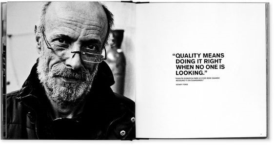
This example has an image on one page and a pull quote on the next. This is a great design that entices readers to turn the page for more. Aside from that, the text also complements the minimalist aesthetic of the photo.
Not to mention, taking up a whole page for a single pull quote will undoubtedly get the attention of your readers–and it also makes a bold statement!
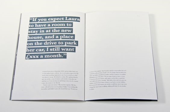
The large, highlighted text might seem a bit daunting, but the content makes up for it. If you want to use this kind of design, make sure your pull quote is thought-provoking and exciting.
This quote design is also an excellent strategy to make use of a blank space in your book.
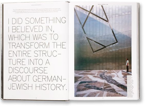
Another excellent example of a pull quote and an image taking up the whole spread of a page. This aesthetic is most commonly seen in magazines and articles.
The font greatly complemented the image, and the size was properly formatted to fit the page, leaving an ample amount of space in the corners.
Aside from the image and layout, people are first attracted to the text content when they read quotes. This sentence provides insights into several key points that will be described in more depth in the book.
That’s why it’s crucial to choose every pull quote you will use. Use powerful words and sentences that will make your readers turn the pages even more.
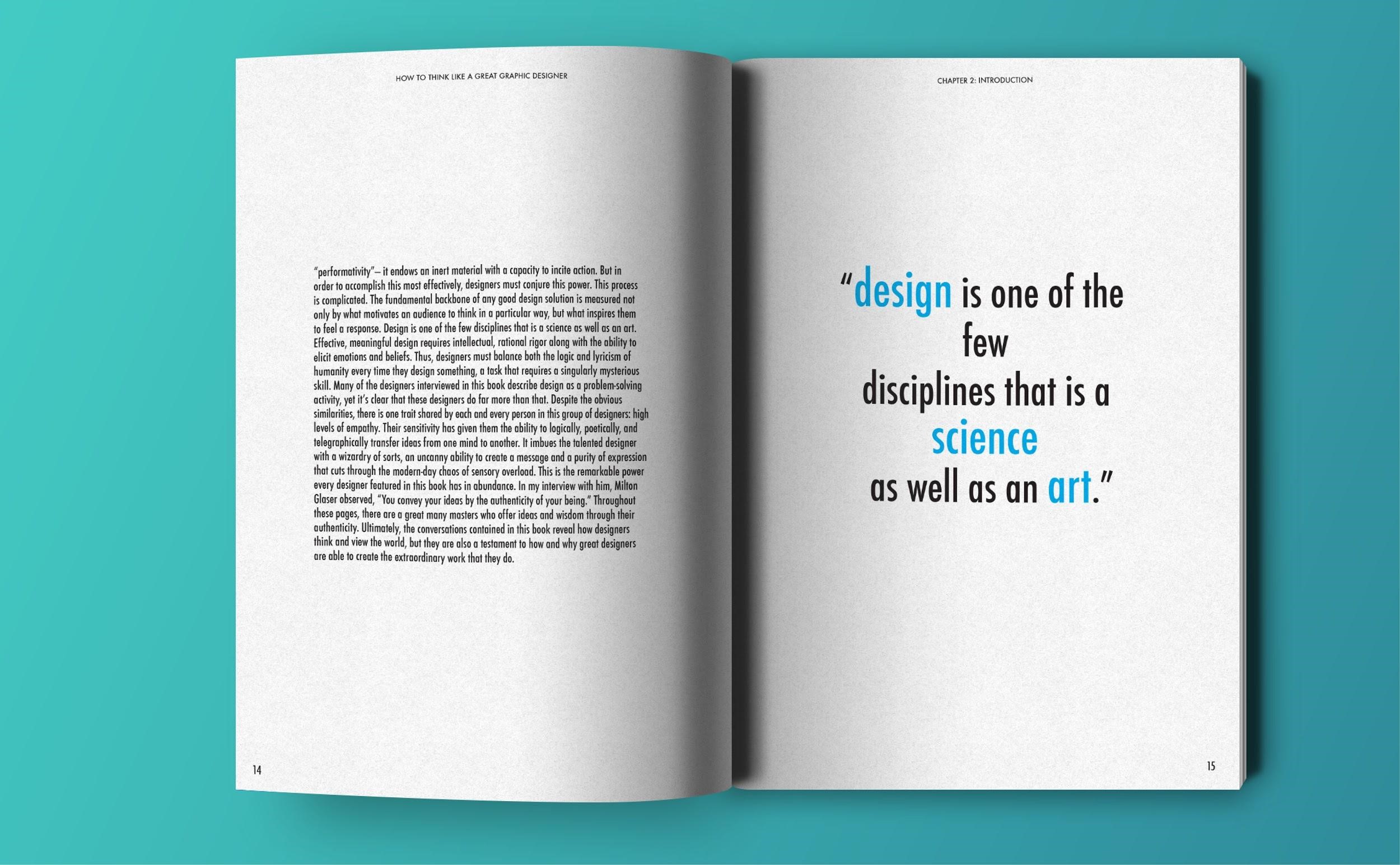
This pull quote is taken directly from the previous page to emphasize a prior statement. It’s a clever tactic so the readers can properly follow the trend of the story.
Some of the words were in a different font color to emphasize the point, but the whole design is still fresh and visually appealing.
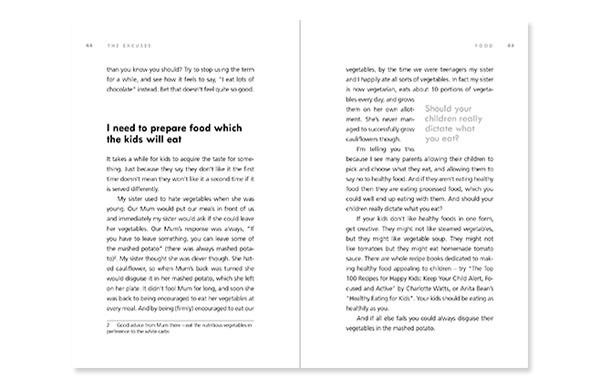
In this example, the quote poses and highlights a question that grabs the readers’ attention. It’s designed in a way where the quote is still in the same text style, but in a slightly larger font.
It catches the readers’ attention without being too loud. It’s an apt design for articles or stories telling a serious topic.
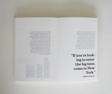
This book opted for text blocks in their design, and the quote emulated the same trend by just being slightly bigger in font compared to the rest of the body.
Beyond Print
The longstanding history of pull-quotes in print has bled over to electronic content as well. Online blog articles also utilize quotes in their content to entice readers, as well as give a refreshing visual appeal to an otherwise boring long-form content.
Many people create quotes like this using an app and other desire to build them directly into their design. Here are a few beautiful examples of online pull quotes found in online blog articles that are all designed in HTML and CSS.
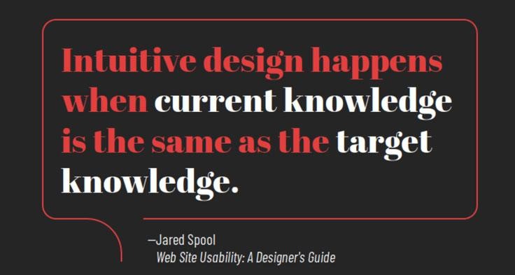
The black theme serves as a great contrast to the red and white text color. The quote is also enveloped in a modern quote bubble.
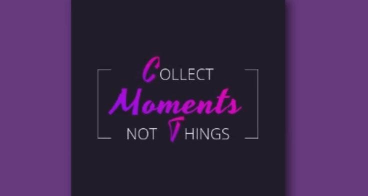
The purple theme shows that the post is leaning towards a female audience, and the bright color vividly expresses uniqueness.
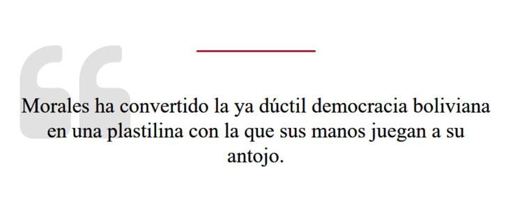
This minimalistic text design suits no-fuss readers who don’t want flamboyance in their content. Whenever you publish a post, think of your target audience and their design preferences.
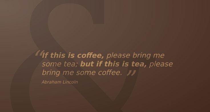
Some say that brown is a garish color, but it certainly gave this pull quote a touch of simple elegance.
More on Quotes
The Audiopedia shared that a pull quote is a key phrase, quotation, or excerpt that has been pulled from an article and used as a graphic element, serving to entice readers into the article or to highlight a key topic. It is typically placed in a larger or distinctive typeface and on the same page.
Give the same amount of effort to your pull quote design as you would any graphic elements in your post or page design, and you’re on the right track!
Have you come across some examples of great lift-out quotes you’d like to share? Post your link below!

