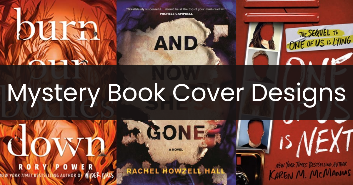
As we peruse bookstore shelves or scroll through online platforms, our eyes often become drawn to many mystery books’ intriguing and engaging covers. When carefully designed, they often feature familiar and eye-catching elements that lure us in with clues and mysterious imagery; from shadowy figures to atmospheric landscapes, all contributing to mystery book covers’ overall allure and genre conventions. Every aspect of mystery book covers—typography, text placement, color scheme, and illustration used—offers us a sneak peek into its realm, providing us a glimpse inside this beloved genre!
Mystery Book Covers
Creating mystery book covers involves striking a delicate balance between arousing curiosity and capturing the essence of the story. The following cover designs do this masterfully:
1. Crystal Widow by Patricia A. Bremmer
Spiders are creatures that usually evoke a specific emotion from those who come across them, whether fear, disgust, curiosity, or awe. This cover uses that emotional attachment to create a design that will elicit an immediate response from anyone who sees it. And after that initial response, readers will see that this particular spider is not like any other spider but made out of crystal, just as the title suggests. As a mystery novel, this book has drawn in the intense curiosity of the readers without even flipping a page yet. The title and author’s name blend in without becoming invisible, appearing made from the same crystal as the spider on the web. And that image, a crystal spider on what seems to be a genuine web, only intensifies the curiosity and eventually opens the book to discover what is happening.

2. Dissolution by C.J. Samson
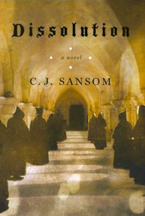
Mystery novels count on human curiosity and the need for knowledge. That’s what makes this cover so incredible! What will make a reader more remarkably curious than seeing an image of what appears to be some secret society, complete with black robes and hoods, embarking down a hallway towards a black door? What makes this cover so much more effective is the backdrop in which these people are walking, with high arched ceilings and multiple precisely shaped windows to light the long walk; the first thought that comes to mind is that they are in a church of some kind. This haunting and strange image, combined with the title’s dark lettering and peculiar font, make this cover a practically perfect entry into the mystery.
3. Only The Truth by Pat Brown
Novels that fall under the mystery genre wrap their readers around truth and lies, plots and schemes, misdirection, and everything hidden. The truth is often only found at the end of the book when all the lies crumble like a house of cards. This cover is a fantastic way of luring readers in with the expectation of an excellent mystery because they know they will get anything but the truth. The title itself lends to the possible discrepancy because its bold statement gets lost in the background as the white letters try to disappear into a pale country scene. The set only adds to the idea of truth and how hazy it can be, with the blurry trees blending in with the sky, like lies can blend in with honesty. This fantastic cover emits the core idea of mystery with a nearly perfect illustration.

4. Carolyn Keene’s The Secret of the Old Clock
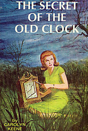
Almost every reader is familiar with the Nancy Drew mystery stories, even if they’ve never read one. That familiarity with that name will immediately give this cover an edge over some of the competition under the same genre. But that’s not the only thing that makes it great. Sometimes, when you leave the mystery in the novel and off the front, it becomes a more successful book. Unlike some covers with illustrations that don’t look like they have anything to do with the title, this one is right on target. Without trying to be coy, the picture of a woman in the middle of a field, at night, opening a clock while looking behind her, is the absolute best way to illustrate this novel in one picture. It doesn’t give anything away but tells the reader exactly what to expect the story to be about. Too often, mysteries go into so many different tangents that it takes effort to keep up with the core storyline. However, this cover lets its readers know that the secret that is about to unfold will only take their attention.
5. In the Dismal Swamp by Patrick Balester
Some pictures, words, and images will elicit a specific response in most people. This cover can do that with both words and pictures, with its careful selection of title and background that it goes with. First, the title makes an immediate impression by focusing on the words “Dismal Swamp” while “in the” is left above like a floating afterthought because they, as words, will not provoke certain feelings like those that follow. Of course, people will get a specific feeling when they read or hear the word dismal as it brings up ideas of unhappiness, darkness, and gloom. On the other hand, the word swamp brings images of murky water, decay, and unpleasant smells. The combination of these two words is a powerful part of this cover. Then there is the background, which puts the words into a solid image that the readers can see. The short and stocky greens trying to sprout from the dark waters of the swamp, a fog that hangs overhead, and threats to overpower the fading sun in the background all of this send the reader a clear message of emotion. The combination of the title and the picture makes this a skin-tingling book cover success.

6. And Now She’s Gone by Rachel Howzell Hall
Effective mystery book covers can convey a sense of intrigue and suspense that complements their titles or stories perfectly, this one in particular through its combination of colors, typography, and other graphic elements. The background is a portrait of a woman whose facial expressions suggest confusion, doubt, or resistance, depending on how readers interpret her emotions. This backdrop is partially out of view, leading readers to question her role and intentions within the book. The scratched paper serves as the foreground, revealing this book’s title. Typography adds another layer of mystery. “And Now She’s Gone” sits above the author’s name and provides credibility to the author’s genre expertise. Put together; this book cover promises readers an engaging reading experience where they’ll want to unravel all that mystery surrounding this woman and her story.

7. Cut to the Bone by Ellison Cooper
While every book cover is unique, certain elements commonly adorn mystery book covers that effectively tease readers with cryptic clues and mysterious imagery to pique their interest. Some creatives use symbols and play with the typography, while others incorporate realistic designs that go with the novel’s title or theme. In this book cover, since the title suggests a “cut,” several “cuts” are made across the cover design, replicating a cut through the paper or skin. It’s hyperrealistic that one may think their copy of the book has cut through it. Adding to this fascinating imagery is the ominous cover illustration showing a misty place surrounded by trees and a tower at the center. Everything about this book cover screams mystery and sinister, and one would immediately understand that this book falls under suspense and thriller.

8. Invisible Girl by Lisa Jewell
Readers can quickly identify books from the mystery, suspense, and thriller genre by the haunting book covers that tempt them into exploring their secrets. For instance, this book cover creates an air of mystery by suggesting something might be lurking below its frosty surface in this illustration. Inside this nebulous frost are roses with thorny stems dotted across the landscape to represent an idyllic tale while simultaneously underscoring that truth may bring pain. Muted shades of gray and blue make this scene indeed come to life. While its title features a sans serif font that effectively balances typography and cover art, each element shines. Overall, this book cover successfully creates an aura of mystery that invites readers to unravel its secrets – much like solving an engaging riddle!

9. Karen M. McManus’ One of Us is Next
A visual explosion of secrets, deceit, and mystery—that’s what makes this book cover so effective for a young adult mystery/suspense novel. The blood-red background suggests that a crime may have occurred, maybe even involving the death of someone related to the characters. There are also four snapshots of individuals with their faces cut out of the picture to create an atmosphere of anonymity while alluding to possible lies or betrayals, something the title also suggests. Meanwhile, the typography used resembles the writing on a blackboard, possibly to give readers the idea of the story taking place on the school premises. Furthermore, its entire concept represents secrecy and intrigue, which could be core themes within its text. This cover design makes an eye-catching statement!

10. The Dark Corners of the Night by Meg Gardiner
Doesn’t this book cover leave a soul-stirring impression? With its mysterious and haunting atmosphere perfectly reflecting its suspenseful novel’s plotline, its design successfully creates an aura of nail-biting danger from its creation. Using predominantly black and gray shades of hue as background to set an air of mystery, at its center is an imposing figure who seems intent on breaking through the surface. Typographically, the sans serif font helps maintain a simple yet dynamic aesthetic for all elements to stand out clearly; its white title contrasted with the author’s name in blood red to signify their expertise within the genre. Overall this book cover captures its story’s spirit by successfully creating an atmosphere full of suspenseful danger from its design!

11. The Lost Sister by ML Rose
Clashing colors can also make a mystery book cover attractive and eye-catching. This book cover, for example, uses shades of blue for the background, which features a house and several haunting trees, much like those you’ll find during the fall or winter season. Empty chairs, trees void of leaves, and what looks like a haunted house create an intriguing mystery on this cover design. Contrasting with this blue atmosphere is the lady running in bright red clothing, creating tension and drama while prompting questions like, “Why is she running?” and “Where does she need to go?” Her red clothes also stand out against the illuminated path in the middle of the book cover, further amplifying the clash of colors in this illustration. The typography? It’s simple and white, enough to give each element of this cover time to shine.

12. They Wish They Were Us by Jessica Goodman
Mystery books with eye-catching covers often preview what readers will expect from the novel they’re about to read. This book cover captures both the tension and mystery ideally without giving too much about the story. Sets against a flannel cloth of blues and greens, the title of this book is displayed through five necklaces. Putting the book’s title in a calligraphic font and gold embellishments adds a layer of sophistication to this thrilling book cover while also hinting at the elite world explored within the book’s narrative. Of course, it’s impossible to ignore the blood stain towards the bottom of the artwork, which will undoubtedly grab the attention of suspense, thriller, or crime fiction lovers. To sum it up, this cover design serves as a portal into the gripping tale of secrets and betrayal that unfolds within the novel, enticing readers to the atmospheric and suspenseful nature of the story.

Conclusion
The book covers of mystery books hold significant weight in captivating readers and conveying the thrill or suspense their story delivers. With a well-executed cover design like those in our list, a mystery book is likelier to stand out on shelves, enticing readers through its visuals while still delivering the story’s themes. Doing so requires them to carefully balance the color schemes they use, the typography, and the central imagery, which does most of the part in these book covers. Designing a mystery book cover may be challenging, mainly if you aim to depict suspense and intrigue, but it’s always possible with some inspiration along the way!
Are you seeking more book cover ideas to inspire your current or next cover design project? Check out our Book Cover Ideas Blog!

