Healthcare information is one of the most searched web results on Google and other search engines. This is because people tend to rely more on information they get from the internet rather than go for a medical check-up, which frankly, makes lots of medical experts shake their heads.
This is why pharmaceutical companies decided to step up their game and entered the online marketing industry.
The websites they put out are mostly aimed to help and assist the general consumer with their healthcare concerns, so they can be fed with actual reliable and well-researched content.
However, most of these pharmaceutical sites are so focused on giving out information that some of them forgot to be accessible and user-friendly for all types of web users.
A lot of the sites we researched threw a lot of information on the homepage that was overwhelming for the first-time visitor, with some of them already uneasy with being prescribed an unfamiliar drug.
Mostly, if a web user sees how complicated a website is, they immediately leave and search for other websites that are more user-friendly, even if the information they put out isn’t really correct.
This behavior can lead to patients misdiagnosing themselves and buying wrong medicines, which can be harmful to them in the long run.
That’s why having a well-designed site is important. The following are the best pharmaceutical websites because they present their information in a way that makes the user read the information — all because of the design. It’s a powerful thing.
To avoid this fiasco, we have put out some of the most reliable pharmaceutical websites you can visit that are known for their well-researched content, superb web design, and excellent user experience.

For type 2 diabetics looking to manage their blood sugar, Onglyza has an informational website broken down into three aspects a consumer may want to know about the tablet: safety information, how it works, and monetary savings their patients can get.
Since the drug’s market leans more towards baby boomers, the site’s information is presented in a no-fuss way to avoid confusion. Most middle-aged adults prefer their information given straight with no other added gimmicks, and that’s how Onglyza did it.

Crestor’s website uses bright blues and oranges to present a bright and lively mood. It’s also interactive, letting the visitor take an artery tour, a weeklong meal planner, and estimating cost, adding value that you can’t get anywhere else.
Being highly interactive, Crestor is an enjoyable website to peruse. Users can learn more about the drug without being bored, and it has other helpful information as well!
Arthritis affects movement, and Celebrex shows how the drug can help users through a series of photographs that show how the body moves while doing an activity. The site is designed to be accessible even for people of old age, making it one of the best corpo pharma sites out there.
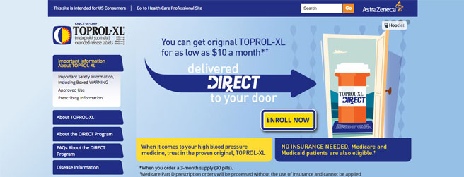
By showing a woman, a couple, and a man who uses Toprol-XL in three photographs, the website tries to relate to the consumer that all kinds of people use the product. It also pulls out essential information in different boxes the user can click on easily.
Seroquelxr has a toned-down website that gives off a calm, subdued feeling. I’d suggest turning the PDFs into a separate window or page. PDFs have to be downloaded, which may turn out to be an unnecessary hassle.
Still, it’s a give-it-to-me-straight pharma website that still scores top marks when it comes to content, ease of use, and overall design.
Pink is connected to breast cancer, so using it on Herceptin makes visitors feel more at ease. But the color isn’t overwhelming or intrusive, and it pairs nicely with the purple. They also offer extensive information about breast cancer and how their drug can help prevent the disease.
The message of Trilipix is executed in a clever way — the words and images tie together. ‘Are you seeing the whole cholesterol picture?’ When you roll over the photos, the images become crisp and clear. Very user-friendly, even the most inept web user can access their website without a hitch.
Cypherstent uses photos of men in action to show how their drugs can help your heart. The search box makes it easy for visitors to look up information that may not be available right away.
Instead of piling up all the information on the homepage, the site allows users to search the information they need in order not to be overwhelmed and confused with all the other medical information listed on the site.

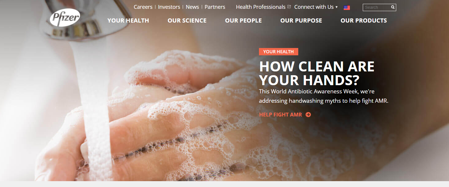
Pfizer is a top global pharmaceutical company. Still, you’ll be surprised how clean, crisp, and highly accessible their website is.
Their content platform is all color-coded, so you know which classification of content you’re currently looking up. Reading up on Pfizer’s site feels like you’re just in another lifestyle blog, but with medically accurate, reliable content!
CONCLUSION
Don’t just rely on the first information you see on the internet. Not all posted on the web is accurate, and you have to be vigilant on what kind of facts you choose to believe.
When it comes to healthcare, you can’t be unsure. Only glean the details you want to learn about in certified medical and pharmaceutical websites.
There are lots of them on the web, and we hope that the ones we listed can help you learn more about you and your loved ones’ health concerns without having a difficult time.
Do you know other corpo pharma websites with excellent web design? Let us know in the comments below!


