The phenomenon of home computer gaming started in the mid-1970s with standalone consoles such as the Atari manufactured “Pong”, and before long, due to the introduction of the desktop PC to many households, users we able to play a plethora of games from the comfort of their studies. Gaming has evolved dramatically over the past 30 years, even more so in the past 10 years, as computer graphics have become powerful enough to depict the most complicated of gaming scenarios, and the prevalence of Internet connectivity in every home has lead to online gaming becoming one of the world’s most popular pastimes.
Quirky and Unusual
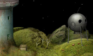
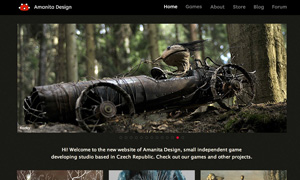
Samorost 2 is the sequel to the well-received original Samorost, developed in 2003. This quirky Flash based game is lusciously textured, with an organic theme and the sound track is perfectly matched to the unusual terrain and setting of the game. In terms of web design, this point and click puzzle has been given a perfect minimalist web setting that really allows the game content to stand out and come to life on the screen. Visiting the developer’s website; Amanita Design, you can see they have taken the same approach to their portfolio of game design work.
Flash-based Gaming
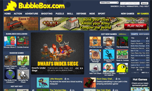
Flash based games are a perfect pastime for adults and children alike, and websites such as Bubble Box host an amazing collection of games available to play for free online. With so much content on offer, it can be hard to categorize appropriately, yet Bubble Box’s navigation is immediately available at the top of the page. However, the thumbnails of the newest and most popular games can be seen in the centre of the page, which is perfect eye candy to draw the user in and partake in a click even for the sake of curiosity.
Bright and Cheery Design for Children
Although many of the games listed above are not suitable for children, Big Fish Games offers many entertaining and educational Flash based games to keep the little ones happy. The bright and cheery background and colors would catch the attention of any child, and the use of thumbnails and green Web 2.0 gradient text all add to the jovial feel of the design.
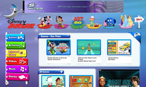
Disney have been entertaining children for decades, and they don’t fail to capture the imagination with their children’s games website. The sky blue background adorned with a smiling sunshine, flowers and popular characters is immediately child-friendly. All text and information is kept to a minimum to avoid confusing the young users, and symbolic icons (such as the rainbow coloured Xylophone navigation) are instantly recognizable to infants and small children.
Gaming for a Good Cause
For those looking to increase their vocabulary and test their knowledge whilst also giving to a good cause, there are rare websites such as Free Rice. Free Rice is a non-profit website, and for every fun question you answer correctly, they will donate 10 grains of rice to the United Nations World Food Programme, the creators of the website. The fresh green color scheme is welcoming and bright, and gives an impression of growth and prosperity, reflecting the overall aim of the website. The simple URL (freerice.com) is direct and to the point, and the banner at the top of the page makes the intentions of the game immediate to the user.
Dedicated Gaming Directories
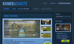
Gamer Charts is a website dedicated to the collation and review of online games of all types, from RPG to Sports to farming simulators. The subtle and subdued steel blue of the color theme gives the website an official tone, and the use of round corner info boxes, diagonal striped backgrounds and drop shadows really give this website a modern look. Navigation is initially kept to a minimum, with the categories expanding on the consecutive pages after the user clicks. To differentiate between the massive amounts of information available on the website, Gamer Charts use rainbow colors to highlight the theme category of info boxes, as this is the first information a user would usually be requiring.
Faith-based Game Discussion
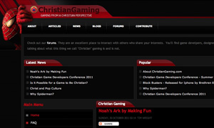
Christian Gaming is an in-depth website devoted to the discussion and review of faith-based games of all genres. The design of this website is striking, with a bold mix of black, red and white. The diverse mix of textures and shading allows the info boxes to stand out from one another, leaving the page organized and less cluttered. However, the eye is immediately drawn to the image on the upper right of the design, which happens to be Spiderman. This is an unconventional alternative to a logo, and this well known character is memorable, and most importantly has a previous cultural dialogue with the user. As the website states; the designers used Spiderman because “he’s cool and he expresses many Christian traits”.
Gray Gradients for Stand-out Content
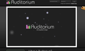
Auditorium is a very modern and stylish graphical, music-based puzzle game, and the in-game graphics feature smoky gray textured backgrounds, that really allow the swirling, glowing interactive particles of light to capture your attention in a somewhat mesmerizing way. The design of this website reflects the design ideals of the game perfectly, with soft gray gradients and muted colored buttons leaving the game the centre of attention.


