Non-Profit Website References
Non-profit organizations usually don’t spend money on things like websites, so it’s always a pleasure to see a really well-done website for these organizations. The following ten non-profit websites are some of the best we have found they do a great job with their designs and the information they give to visitors.
Table of Contents
Here are the Best Non-Profit Websites
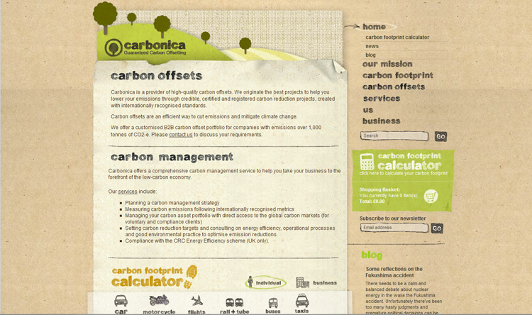
Carbonica
Offers a creative, natural motif to go along with their attempt at combating global warming. Their site is user-friendly and a pleasure to look at with its soft, natural colors.
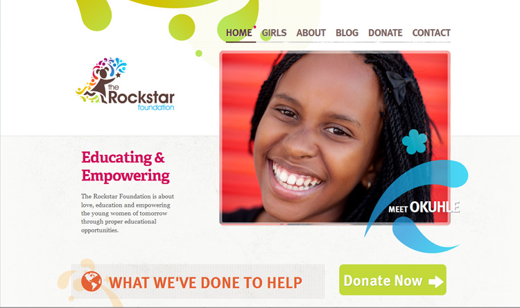
The Rockstar Foundation
Offers a clean and exciting design that’s nice and open with plenty of white space. The interesting graphics and colors go well with their mission of educating young women.
DSWF NEWS: Good news – our website has been named in the top 20 best non-profit websites 2017. Find out why! https://t.co/aPuP3GBQUd pic.twitter.com/gWsICk9Wd4
— David Shepherd Wildlife Foundation (@DSWFWildlife) June 23, 2017
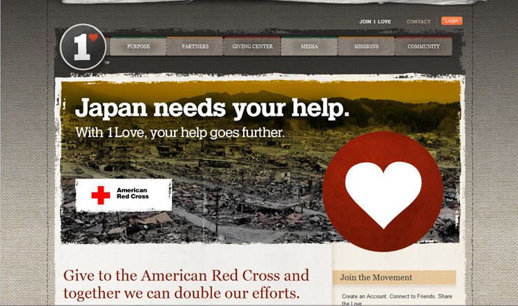
1Love
Combines several textures and gradients to make their design really stand out. Their choice of colors really compliment each other and their layout is easy to follow and nice to look at.
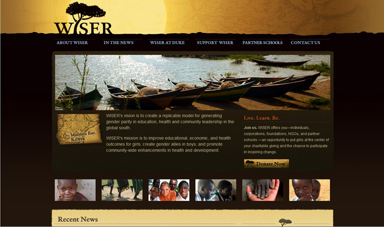
Wiser’s
Color and texture choices are absolutely beautiful. Their whole website brings to mind Arfica and their layout is extremely efficient.
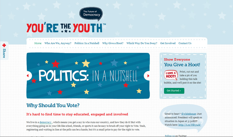
You’re the Youth
Has a very nice political feel to it without being boring. The graphics and colors are interesting and catchy, drawing in the viewer and making them want to know more.
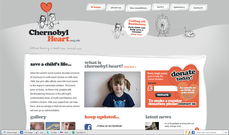
Chernobyl Heart’s
Almost monochromatic design lets the few instances of color show through brilliantly. Their illustrations add to the child-like atmosphere and their layout is nice and clean cut.
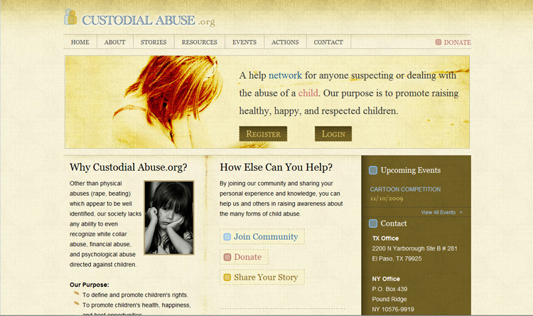
Custodial Abuse
The website has a nice clean layout and their color choice is very soothing. They provide all the information you could possibly want in an easy to find manner, making their website very user-friendly.
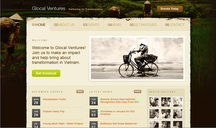
Glocal Ventures
Has a simple and effective layout providing all the useful information upfront. The picture framing the main portion of the layout is a very nice touch and adds a bit of flavor to help spice it up.
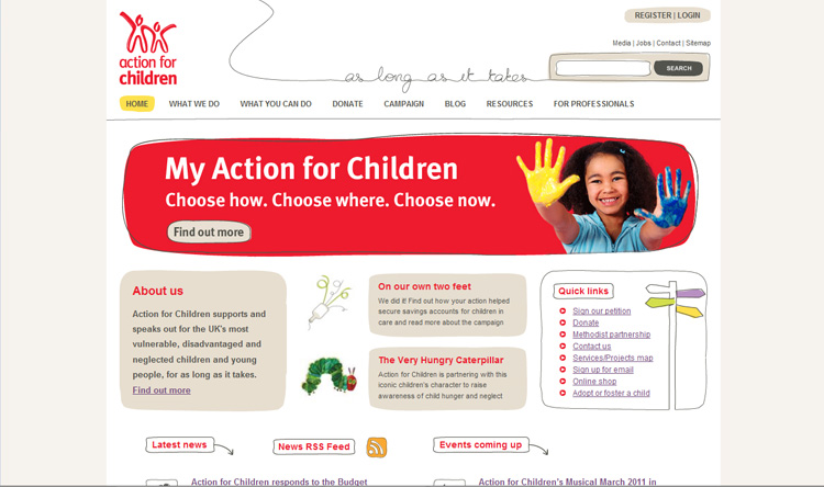
Action for Children’s
A website is nice and open, simple but very attractive. The layout is easy to navigate and the illustrations add a nice touch to the overall design.
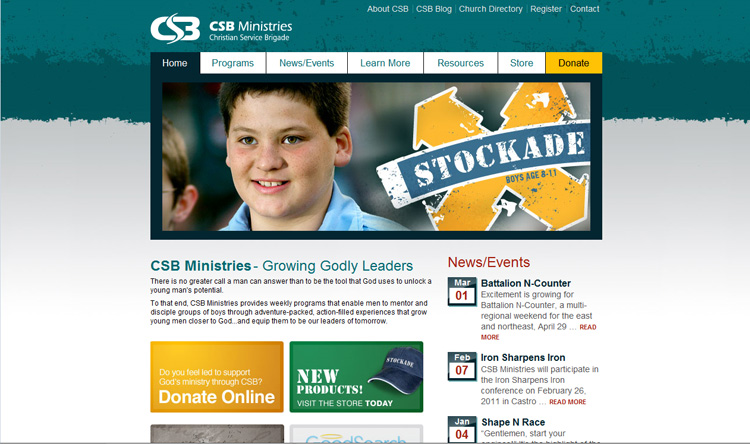
CSB Ministries
Has a cool color scheme contrasted very nicely by the yellow dotted through the layout? Their navigation is easy to use and their photographs are very well done.
Read Next Article: Best Dentist Website Designs

